

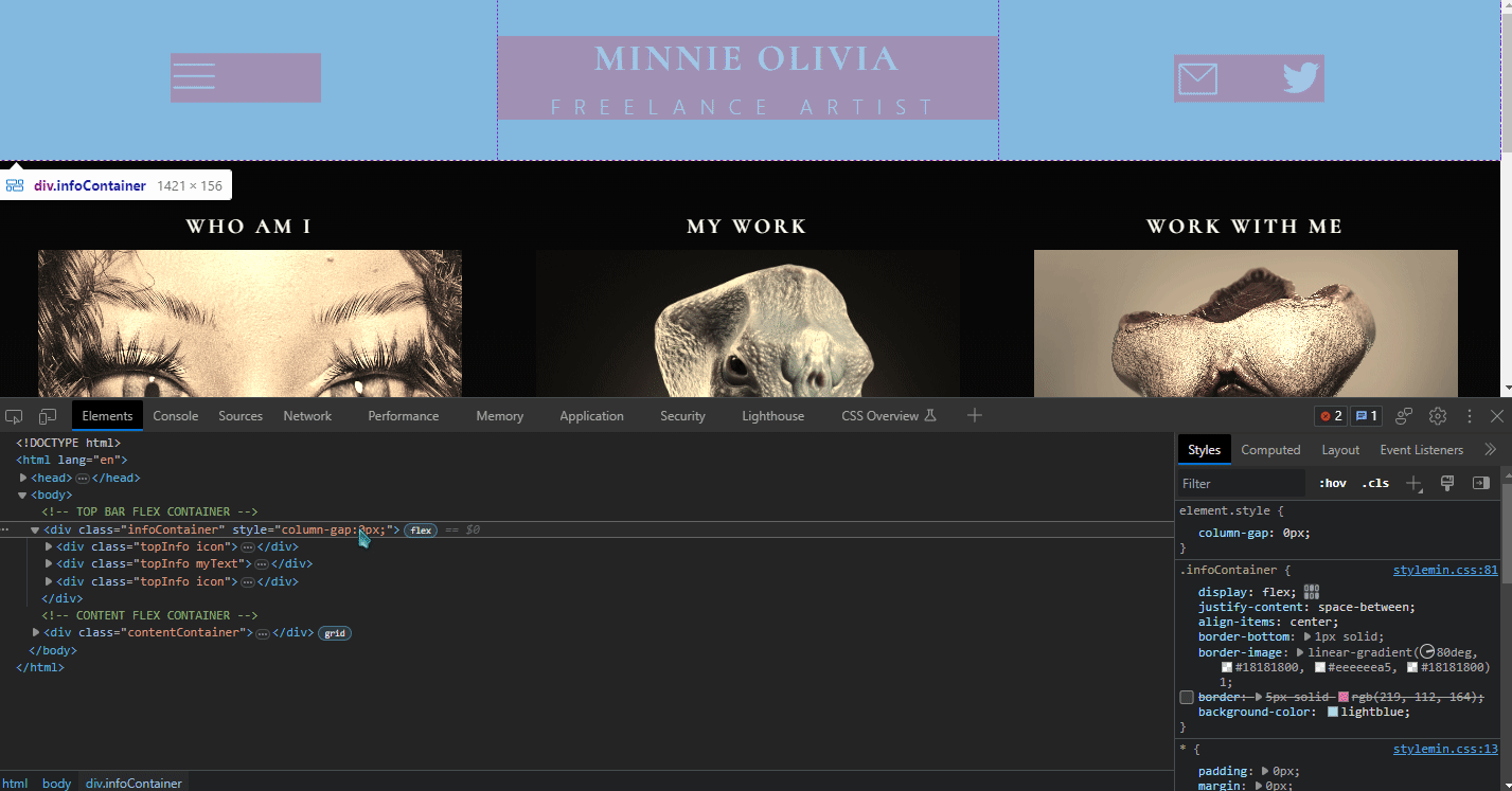
Please help me push these further to either side. It has colors to better visualize the flexbox.
HTML:
`<div class=“topInfo icon”>
<img src=“icons/icon1.png” alt=“” class=“hamburgerIcon”>
</div>
    <div class="topInfo myText">
        <h1>MINNIE MINNIE</h1>
        <p class="spaced">FREELANCE ARTIST</p>
    </div>

    <div class="topInfo icon">
        <div class="rightIcons">
            <img src="icons/icon2.png" alt="" class="mailIcon">
            <img src="icons/twitterlogo.png" alt="" class="twitterIcon"">
        </div>
    </div>
`
CSS:
``/* TOP BAR FLEX CONTAINER */
.infoContainer {
display: flex;
justify-content: space-between;
align-items: center;
border-bottom: 1px solid;
border-image: linear-gradient(80deg, #18181800, #eeeeeea5, #18181800) 1;
}
.topInfo {
flex: 1;
}
.rightIcons {
display: flex;
justify-content: space-between;
align-items: center;
}``
#css #frontend #webdesign #cascadingstylesheets #html #coding
Take a look here: https://developer.mozilla.org/en-US/docs/Web/CSS/column-gap
Make the change on
div.infoContainer.im a beginner so im prolly doing it wrong but it doesnt appear to have worked?:
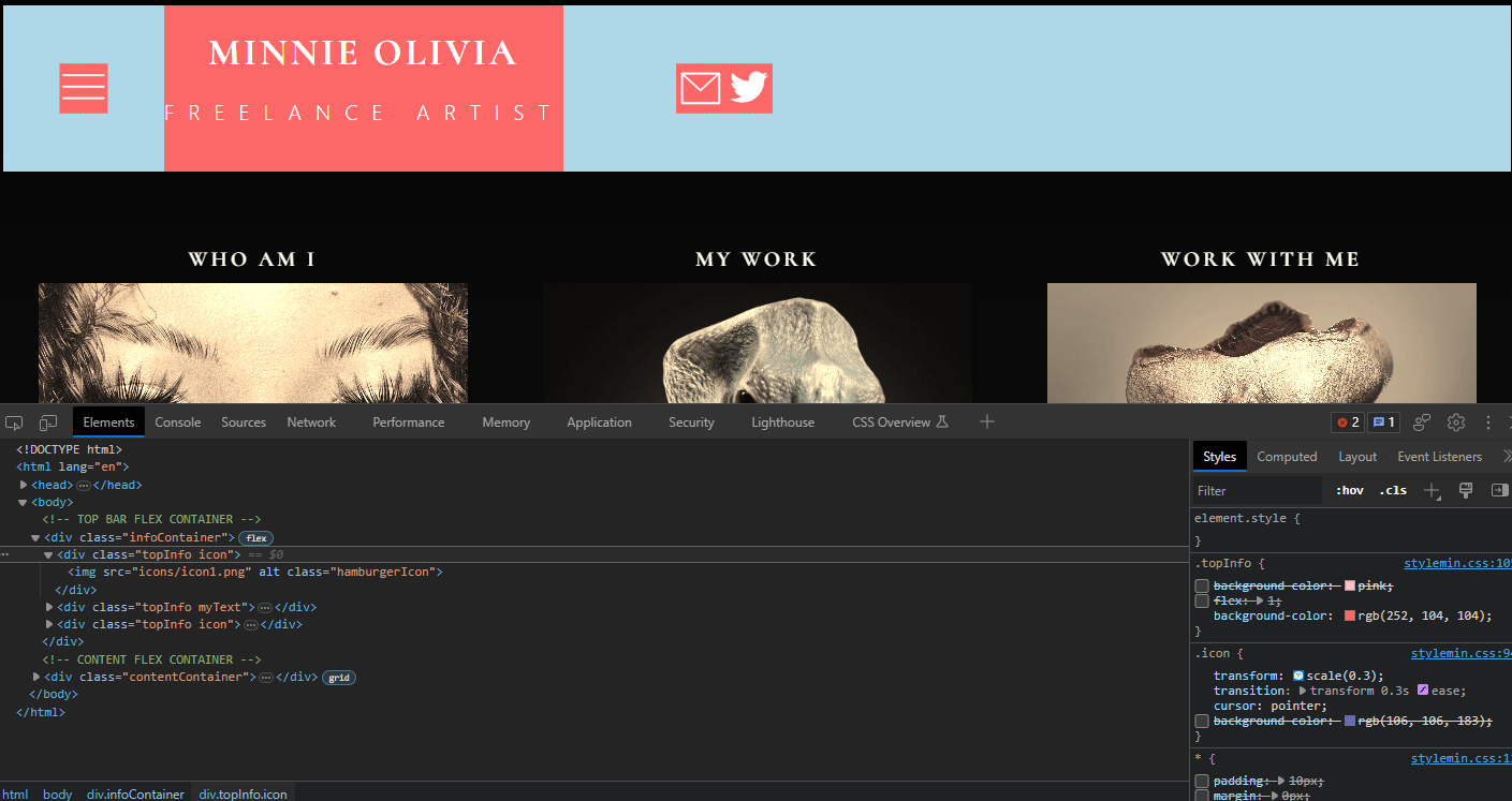
Well, I mean it works a little… But I think your main problem is on the .icon transform.
the icon transform was the big issue haha. i had no idea i shouldnt have used that, changing the hover effect from transform to height changes helped a lot

![[Solved] [Help] I am using flexbox for the top portion, but no matter what I do I cannot figure out how to get the icons to be pushed further to either side.](https://media.kbin.social/da/17/da17d182964fc7f4819940735f13cf80c3475563a6da5328ba6c05c561d0bb6f.png)